Identity guidelines for consistent brand representation
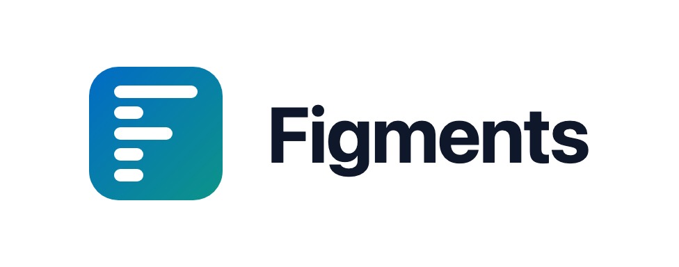
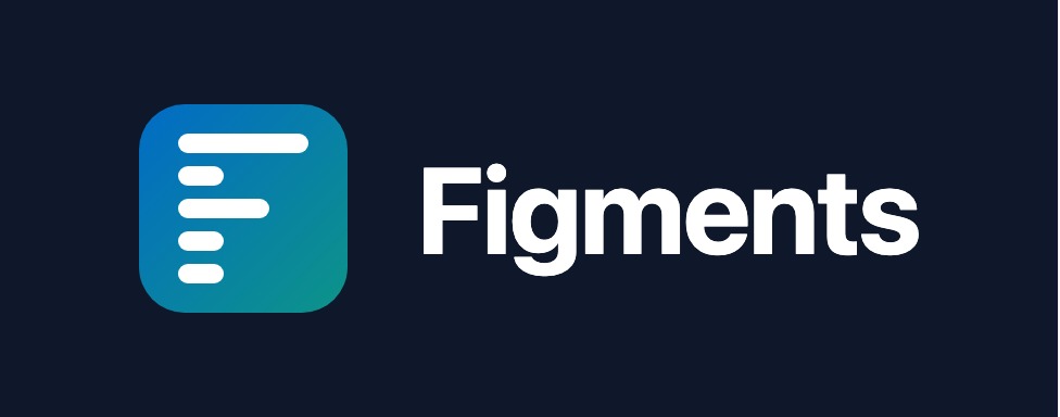
The Figments logo is a stylised "F" made from horizontal bars of decreasing length, set on a blue-to-teal gradient rounded square. The bars represent structured clinical data — notes, goals, and progress — distilled into a clean, readable form.
Always maintain clear space around the logo equal to the height of one bar in the "F" mark. Never display the logo smaller than 24px.
Dashed border = minimum clear space. Keep this area free of text, other logos, and page edges.
Minimum size: 24px (favicon) | Preferred: 32px+ (UI) | Print: 10mm+
The gradient flows from Brand Blue to Brand Teal at 135 degrees. Use the gradient on the logo and key brand moments. Use the individual colours for UI elements.
Figments uses Geist Sans by Vercel as its primary typeface. It is a clean, modern sans-serif designed for digital interfaces.
Right-click and "Save link as..." to download each asset. Every variant is available as vector (SVG/PDF) or JPG.